NARRATIVE UX
Complex problems solved with structure, not decoration
GRANTA
From fragmented specs to a unified knowledge system
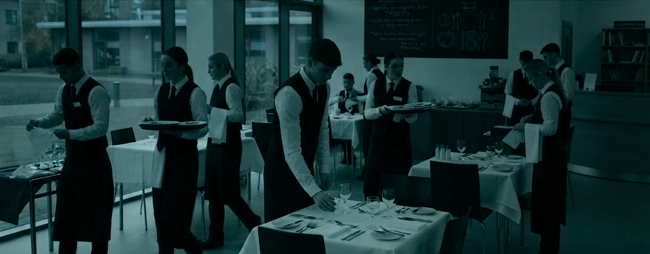
A hospitality college providing various courses proved a challenge, where the site, the media and articles became integral to a single offering about detail and care.

VELOCITY TRAING
A marketing ENGINE that loads like a machine tool
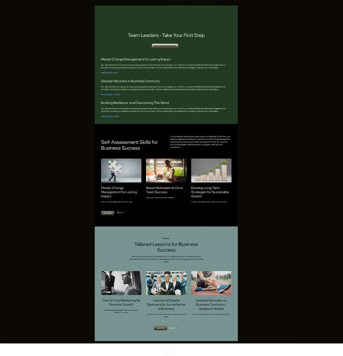
We lifted a high-functioning training company by ensuring that it’s narrative was strongly linked to personal success stories, across notable platforms, such as Wikipedia. Visitors were taken on consistent personal journeys that layered the Brand across the web, adding weight to stories across different contexts and solidifying impact.

ASTERION
A complex service explained in one hard sentence
A materials firm, spread out over specialized product and research and development couldn't articulate its broad value and was losing traction to semantic inconsistency. With one simple sharp proposition - understanding why materials fail - papers, site and research were made readable and 65% more authoritative.
WORK STRUCTURED AROUND HARD QUESTIONS...
Most agencies see a logo and a color palette. They optimize for appearance. They deliver decoration. A company is not a lifestyle brand. Your value is not a vibe. It is a hard-won, deeply layered expertise that took decades to build. When an agency reduces that to a slick visual trend, they strip away your authority. They make you look like everyone else.
The standard process starts with a mood board, not a question. It prioritizes how things look over what they mean. For a consumer product, this can mean a slow erosion of credibility. Your website becomes a collection of pretty pages, not a coherent system of knowledge.
Search engines compound the problem. They do not reward beauty. They reward structure. A site built on aesthetics alone is invisible to the machines that connect you to your next client. Google cannot admire your gradient. It can only parse your schema. Without a semantic foundation, your expertise is buried under a million better-structured competitors. You are losing not because your work is inferior, but because your signal is noise.
We solve this by starting where agencies stop. We begin with the hard question of what you actually know. We excavate the core narrative that makes your company indispensable. Then we build a digital architecture that makes that narrative readable to both a customer and a search crawler. The result is not a decorated brochure. It is a durable, high-clarity system that proves your authority before a single pixel is admired.
Semantic architecture builds trust
GRANTA
What was wrong?
The institute possessed a rich ecosystem of courses, editorial articles, media assets, yet its digital presence failed to reflect the meticulous nature of high-touch service.
The site operated as a disjointed educational directory where valuable content was siloed, obscuring the institution’s promise: a dedication to detail and care. Without a cohesive visual hierarchy or unified content flow, the platform struggled to translate prestige and nuance of physical training into a digital experience, leaving visitors with a fragmented view of their offering.
.avif)
.avif)
GRANTA
What did I change & What became possible?
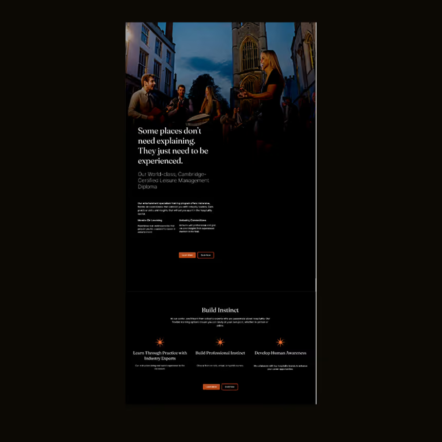
To bridge this gap, the interface was re-architected to treat screen design as an extension of hospitality itself. By harmonizing course discovery, insights, and media under a structured layout with visual pacing, the site now delivers a fluid, narrative-driven journey.
This shift elevated digital presence from a standard course catalogue into an immersive, authoritative brand platform. articulating its broader educational ecosystem, capturing visitor interest by refined storytelling while demonstrating commitment to precision at every touchpoint.
granta
Hospitality is defined by hospitality’s details; a principle that directly guided our design framework for this college. To present a diverse curriculum alongside rich articles and media, we created an adaptable UI focused on clarity, visual harmony, and intuitive flow.
The result is a unified platform where site structure and aesthetic polish work together to reflect the institution’s core promise: meticulous care at every touchpoint.
.avif)
granta
Key themes
Translating Service to Digital: Framing screen design as an extension of "hospitality."
Harmonizing Complexity: Explaining how media, articles, and course listings were brought together without clutter.
Intentionality: Connecting layout choices (pacing, visual hierarchy) back to the core concept of "detail and care."
Velocity training
What was wrong?
Despite delivering high-impact training, the brand suffered a lack of narrative continuity across the web. The existing site relied on conventional, course listings, failing to connect internal capability with external validation.
By isolating outcomes within basic testimonial blocks, the company missed an opportunity to leverage authoritative external profiles - eg Wikipedia entries and LinkedIn achievements, reinforcing real-world credibility. This disconnect made it difficult for clients to gauge the scale and weight of the offering.
.avif)
velocity training
What did I change & What became possible?
The digital strategy was pivoted to center the user experience entirely around human success stories and interconnected brand authority. By engineering a UI that embeds personal journeys into the visual rhythm—and actively bridges on-site case studies with external proof points on LinkedIn and Wikipedia - the layout creates a multi-touchpoint ecosystem of trust. This shifted the perception of the business from a service provider to an industry authority.
velocity training
Hospitality is defined by hospitality’s details; a principle that directly guided our design framework for this college. To present a diverse curriculum alongside rich articles and media, we created an adaptable UI focused on clarity, visual harmony, and intuitive flow.
The result is a unified platform where site structure and aesthetic polish work together to reflect the institution’s core promise: meticulous care at every touchpoint.
ASTERION
WHAT WAS WRONG?
Spanning multiple specialized verticals across R&D, and product lines, Asterion was losing commercial traction due to semantic fragmentation.
The breadth of their technical capability was buried under fragmented terminology and dense, unoptimized documentation. Unable to clearly articulate their value proposition, the brand struggled to communicate complex engineering concepts to dms, diluting subject-matter expertise and slowing market adoption.
.avif)
asterion
What changeD & became possible?
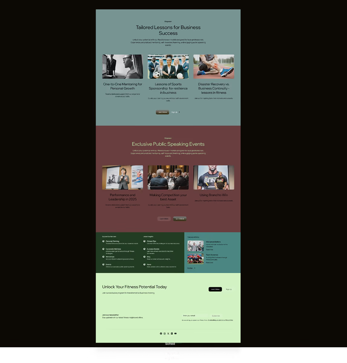
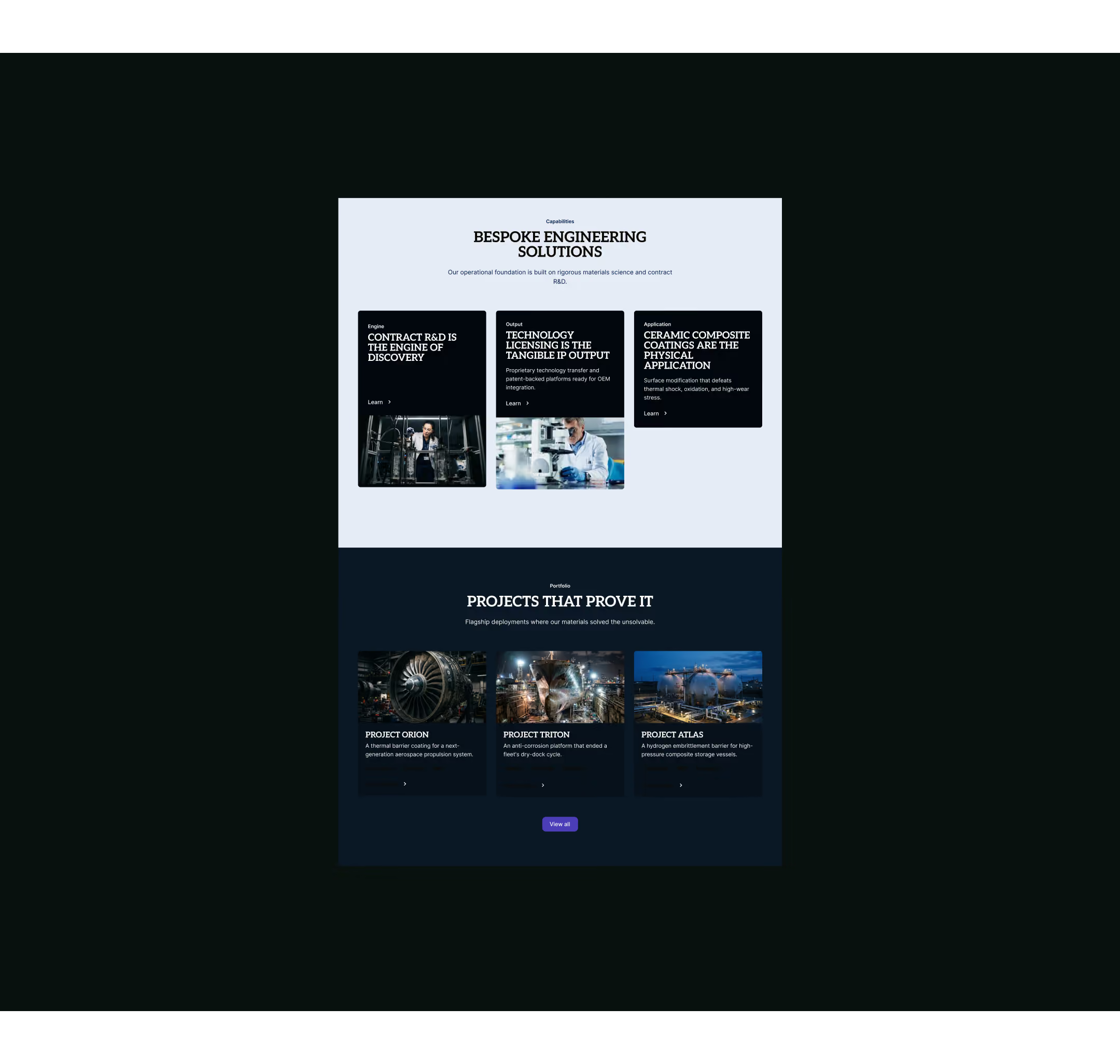
The entire digital architecture was restructured around a single proposition: understanding why materials fail. The design introduced stark typographic contrast, scannable data comparison matrices, and modular case study blocks that turn complex material science into a readable, highly structured UI.
Grounding the platform in semantic clarity and clear information hierarchy increased the authority and readability of their site, papers. This systematic layout allows clients to digest complex data, turning raw R&D to a clear, decisive market advantage.
asterion
Semantic Systematization: Highlighting how UI choices (tables, modular blocks) turn complex technical jargon into structured, readable data.
Authority via Precision: Linking the stark, precise visual language (deep blues, clean typography, high-contrast UI elements) to their expert positioning.
Streamlined Value Proposition: Explaining how design bridged the gap between raw R&D research and client-facing commercial value.
.avif)
...AND HARD DESIGN CHOICES.
Aesthetics are easy. Clarity is the hard work. We make the hard choices so your expertise is undeniable.
Your project is not standard
Complex requirements demand a structured approach. Tell us about the problem you need solved.